Theme Settings
If you use the sbt plugin or the parsers, renderers or transformers from the laika-io module,
each transformation is based on a theme that provides a set of default templates and styles for all output formats.
If you use a pure transformer from the laika-core module,
there is no theme support as these transformers only process a single string as input and output.
This chapter documents Laika's only built-in theme, called Helium, and its configuration options.
The Helium Theme
The name of Laika's default theme reflects its lightweight nature as it is not based on any CSS or JavaScript libraries like Bootstrap, but instead only comes with a minimal set of hand-crafted CSS and JavaScript.
Helium includes default styles for websites, EPUB and PDF documents, so you can generate a documentation site complete with a download page for e-book formats in one go.
The generated site is responsive and designed to work well on smaller devices.
Without any explicit theme configuration, Laika transformers run with the Helium theme and all its defaults, which is equivalent to the following configuration:
import laika.helium.Helium

laikaTheme := Helium.defaults.build
import cats.effect.IO
import laika.api._
import laika.format._
import laika.io.syntax._
import laika.helium.Helium
val transformer = Transformer
.from(Markdown)
.to(EPUB)
.parallel[IO]
.withTheme(Helium.defaults.build)
.buildIf you are fine with your site and e-books looking exactly like Laika's documentation, including its choices for colors and fonts, you can skip the theme configuration step.
Otherwise you have the following options:
-
To tweak just some aspects of the look and feel like the color schemes and fonts and to add custom links, metadata and custom styles to the default theme, follow the instructions in this chapter below.
-
If you want full control and design everything from scratch, you can alternatively install
Theme.emptyinstead of Helium's defaults and then add all templates and CSS files to your input directories. See Creating Templates for details. -
If you want full control, but re-use your design across multiple projects or publish it as a 3rd-party theme, see Creating Themes for details.
-
Hopefully at some point there is also a selection of 3rd-party themes available.
Helium Configuration API
Helium can be fully configured with its Scala API and does not require any configuration files.
The entry point for all configuration steps is always Helium.defaults to ensure there are sensible defaults
in place for all the options you omit in your configuration.
For each configuration step you need to choose one of the four selectors,
either all to specify options for all three output formats or site, epub or pdf to select a single format.
Not all options are available for all formats, but the IDE's context help and the documentation below can guide you.
In the minimal example below we only specify some metadata for all formats as well as the navigation depth for EPUB and PDF:
import laika.helium.Helium

val theme = Helium.defaults
  .all.metadata(
    title = Some("Project Name"),
    language = Some("de"),
  )
  .epub.navigationDepth(4)
  .pdf.navigationDepth(4)
  .build
Laika also provides convenient constructors for some of the data types used frequently in its theme API.
You can import laika.theme.Color._ for specifying colors with hex("ffaaff") or rgb(255, 0, 0) and
laika.ast.LengthUnit._ for specifying sizes with px(12) or pt(9) or other available units.
All configuration examples in this chapter assume these imports are in place.
The final call to build produces a ThemeProvider that can be passed to Laika's transformers
or the laikaTheme sbt setting:
laikaTheme := themeval transformer = Transformer
.from(Markdown)
.to(EPUB)
.parallel[IO]
.withTheme(theme)
.buildFonts
By default Laika includes three fonts in its published artifact so that they are ready to be embedded into EPUB or PDF documents. All these fonts are licensed under the Open Font License:
Lato(for headlines and body text): https://fonts.google.com/specimen/Lato#aboutFira Mono(for code blocks and inline code): https://fonts.google.com/specimen/Fira+MonoIcoFont(for Laika's small set of icons): https://icofont.com/icons
You can override these defaults by defining your own set of fonts.
This is an excerpt of Laika's default configuration as an example:
import laika.theme.config._

val fontPath = "<file-path-to-your-fonts>"
val latoURL = "http://fonts.googleapis.com/css?family=Lato:400,700"
val firaURL = "https://fonts.googleapis.com/css?family=Fira+Mono:500"

Helium.defaults.all.addFontResources(
  FontDefinition(
    Font
      .withEmbeddedResource(fontPath + "Lato/Lato-Regular.ttf")
      .withWebCSS(latoURL),
    "Lato", FontWeight.Normal, FontStyle.Normal
  ),
  FontDefinition(
    Font
      .withEmbeddedResource(fontPath + "Lato/Lato-Bold.ttf"),
    "Lato", FontWeight.Bold, FontStyle.Normal
  ),
  FontDefinition(
    Font
      .withEmbeddedResource(fontPath + "FiraMono/FiraMono-Medium.otf")
      .withWebCSS(firaURL),
    "Fira Mono", FontWeight.Normal, FontStyle.Normal
  ),
  FontDefinition(
    Font
      .withEmbeddedResource(fontPath + "icofont/icofont.ttf")
      .withWebCSS("../icons/icofont.min.css"),
    "IcoFont", FontWeight.Normal, FontStyle.Normal
  )
)
The withEmbeddedResource method picks the font to be embedded from the resource directory inside the jar,
use withEmbeddedFile to pick a font from the file system.
Font embedding will be performed for EPUB and PDF output.
For the site you can use the withWebCSS method to link to the CSS containing the font-face definitions.
It will automatically be included in the <head> sections of the generated HTML
without the need to adjust the default templates.
Note that the use of the addFontResources method will add the specified fonts to the Helium defaults.
If you want to replace the built-in fonts you can precede the call with clearFontResources.
This way you can ensure that no unused font resources will be embedded.
If you want to replace just some of the built-in fonts, you can use removeFontResources which expects
a filter function.
Additionally, you can define the font families and font sizes for the site and e-books:
import laika.ast.LengthUnit._

Helium.defaults
  .all.fontFamilies(
    body = "MyBodyFont",
    headlines = "MyHeadlineFont",
    code = "MyCodeFont"
  )
  .site.fontSizes(
    body = px(15),
    code = px(14),
    title = px(34),
    header2 = px(28),
    header3 = px(20),
    header4 = px(15),
    small = px(12)
  )
  .pdf.fontSizes(
    body = pt(10),
    code = pt(9),
    title = pt(24),
    header2 = pt(14),
    header3 = pt(12),
    header4 = pt(11),
    small = pt(8)
  )
The example above specifies the three font families with the all selector, defining them for all output formats.
Make sure the names match font resources defined in the previous step so that they are available for embedding.
The font sizes on the other hand will often be defined per format, the example above shows the definitions for the site and PDF output.
Colors
Helium lets you define two different color sets: The theme colors which are used for headlines, links, navigation and backgrounds as well as the syntax coloring scheme to be used for all code blocks.
Theme Colors
The following example overrides Laika's theme colors for all output formats:
import laika.theme.config.Color

Helium.defaults
  .all.themeColors(
    primary = Color.hex("007c99"),
    secondary = Color.hex("931813"),
    primaryMedium = Color.hex("a7d4de"),
    primaryLight = Color.hex("ebf6f7"),
    text = Color.hex("5f5f5f"),
    background = Color.hex("ffffff"),
    bgGradient = (Color.hex("095269"), Color.hex("007c99"))
  )
The default theme colors, which are used for the documentation you are reading right now, are as follows:
primary
secondary
primaryMedium
primaryLight
primaryis used for highlights and the text of navigation panes and inline code spans.secondaryis used for links and headlines.primaryMediumis usually a shade slightly darker thanprimaryLight, used for borders and text on dark background.primaryLightis usually a lighter shade of the primary color, used as background color.textis solely used as the color of the body text.backgroundis used as the background color of the main content column (side bars and top navigation bars have different backgrounds).bgGradientis a pair of colors currently only used for the gradient on the landing page.
In terms of getting the right contrast, the color combinations must support the following:
- Text in
primarycolor must be readable onprimaryLightbackground. - Text in
primaryMediumcolor must be readable onprimarybackground (this combination is only used on the landing page).
Syntax Highlighting
These settings are only relevant if you use Laika's built-in highlighters,
in case you prefer to use a 3rd-party library like highlight.js you need to use their styling mechanism.
Laika's own syntax color scheme is built around sets of 10 colors, of which 5 are usually a set of grayish colors from light to dark with almost no saturation and a set of 5 colors which are supposed to be positioned around the color wheel.
The defaults for Laika's dark theme (as used on this site) are:
base-1
base-2
base-3
base-4
base-5
wheel-1
wheel-2
wheel-3
wheel-4
wheel-5
For the light scheme (used by default in EPUB and PDF output) they are:
base-1
base-2
base-3
base-4
base-5
wheel-1
wheel-2
wheel-3
wheel-4
wheel-5
They can be overridden per format or for all at once:
import laika.theme.config.Color._
import laika.helium.config.ColorQuintet

Helium.defaults
  .all.syntaxHighlightingColors(
    base = ColorQuintet(
      hex("2a3236"), hex("8c878e"), hex("b2adb4"),
      hex("bddcee"), hex("e8e8e8")
    ),
    wheel = ColorQuintet(
      hex("e28e93"), hex("ef9725"), hex("ffc66d"),
      hex("7fb971"), hex("4dbed4")
    )
  )
For dark themes the base colors have to go from dark to light, for light themes the other way round.
The base colors are used as background color (the first), for comments, punctuation, identifiers and uncategorized spans, the wheel colors are used for the more significant types of code spans. Amongst others these are substitution references, annotations (1st color), keywords, escape sequences (2nd), attribute names, declaration names (3rd), all types of literals (4th), type names, tag names (5th), and several categories for other types of syntax, e.g. in text markup.
Dark Mode
For EPUB and HTML output Laika also supports explicit configuration for dark mode.
This requires e-book readers and browsers which support the CSS for dark mode
(the color-scheme attribute and the prefers-color-scheme media query).
In supported software the color sets configured for Helium's dark mode become active
whenever the user has switched on dark mode in the OS or in the reader software.
The following example defines custom theme colors for dark mode in EPUB output:
Helium.defaults
  .epub.darkMode.themeColors(
    primary = Color.hex("a7d4de"),
    secondary = Color.hex("f1c47b"),
    primaryMedium = Color.hex("a7d4de"),
    primaryLight = Color.hex("125d75"),
    text = Color.hex("eeeeee"),
    background = Color.hex("064458"),
    bgGradient = (Color.hex("064458"), Color.hex("197286"))
  )
Similar configuration can be added for site output and syntax highlighting colors.
The default theme colors for dark mode, which are used for the documentation you are reading right now, in case you have set dark mode as your preference, are as follows:
primary
secondary
primaryMedium
primaryLight
The meaning of "light" and "medium" are inverted here, to avoid confusion with names for the light mode scheme. For an overview how these colors are used, see Theme Colors above.
Please note that while Laika also technically supports dark mode configuration for EPUB output, the support in reader software is currently so poor that it's usually not worth it. Syntax highlighting colors, for example, are ignored in dark mode in most readers, making dark mode for EPUB quite an unattractive choice for technical documentation.
Layout
The configuration API allows to control a few aspects of the layout, like columns widths and line heights, that are the most likely candidates for frequent adjustments.
These are the options for the site:
import laika.ast.LengthUnit._
import laika.helium.config.AnchorPlacement

Helium.defaults
  .site.layout(
    contentWidth = px(860),
    navigationWidth = px(275),
    defaultBlockSpacing = px(10),
    defaultLineHeight = 1.5,
    anchorPlacement = AnchorPlacement.Left
  )
The example shows the values for Helium's defaults. contentWidth is the maximum width of the main column,
navigationWidth the width of the left navigation pane, defaultBlockSpacing the space between block elements
in the main column and defaultLineHeight the line height of normal paragraphs.
anchorPlacement configures the little anchors for section headers that appear on mouse-over and allow to copy the URL.
The default is Left, other options are Right or None.
If you need to tweak the layout beyond these options you can always include custom CSS files in your input directory that override additional styles.
For PDF output you can also define the page size and margins:
import laika.ast.LengthUnit._

Helium.defaults
  .pdf.layout(
    pageWidth = cm(21),
    pageHeight = cm(29.7),
    marginTop = cm(1),
    marginRight = cm(2.5),
    marginBottom = cm(1),
    marginLeft = cm(2.5),
    defaultBlockSpacing = mm(3),
    defaultLineHeight = 1.5,
    keepTogetherDecoratedLines = 12
  )
Again, the example shows the defaults. The properties for the page dimensions and margins should be self-explanatory,
defaultBlockSpacing and defaultLineHeight are analogous to the site settings.
Finally, keepTogetherDecoratedLines controls the number of lines for decorated blocks like code examples or callouts
that should always be kept on the same page.
With the above setting of 12 only blocks with more than 12 lines are allowed to be split across multiple pages.
Metadata
Helium allows to define a small set of metadata that describes the output.
In the generated site it will be used to populate the <head> section of the HTML output,
for EPUB and PDF it will be used to embed the information into the generated files
in a way that the respective readers understand.
Like many other options, you can specify metadata either with the all selector for all formats,
or define them separately with the epub, pdf or site selectors.
import java.time.OffsetDateTime

Helium.defaults
  .pdf.metadata(
    title = Some("Project Name"),
    description = Some("Fancy Hyperbole goes here"),
    identifier = Some("XSD-9876-XVT"),
    authors = Seq("Maria Green", "Helena Brown"),
    language = Some("de"),
    datePublished = Some(OffsetDateTime.now),
    version = Some("2.3.4")
  )
When using the sbt plugin the title, description and version metadata will be pre-populated by the standard
sbt settings name, description and version respectively.
When using the library API no medata will be defined by default.
It is recommended to always define the language and title as the minimum set of metadata.
Metadata for Individual Documents
The API shown above specifies metadata globally which is most convenient for output formats like PDF or EPUB, which produce a single artefact. For site generation you may want to override some of these values per page. You can do that in a configuration header of your markup document:
{%
laika.metadata {
  authors = ["Helena North", "Maria South"]
  datePublished = "2012-10-10T12:00:00"
  dateModified = "2014-07-07T12:00:00"
  canonicalLink = "http://foo.org/page.html"
}
%}
These values can then be used in templates like other substitution variables:
<meta itemprop="datePublished" content="${laika.metadata.datePublished}">The canonicalLink property will automatically render as a link rel="canonical"... tag in the HTML output
when using the Helium theme.
Otherwise the page-level metadata is a core feature and available even when not using the Helium theme.
Note that, at the moment, dateModified is not auto-populated from the file system and has to be set manually.
In many cases this is desirable anyway, as not every file modification represents a meaningful change to the user.
Navigation, Links, Favicons & Footer
This section describes the navigation options specific to the Helium theme. There are several other navigation features which are supported independent of the theme in use, like the option to centralize all definitions of external links. They are described in a dedicated Navigation chapter.
Main Navigation
By default the Helium theme includes a left navigation pane that is auto-generated based on the structure of your input directories and is up to 2 levels deep.
You can override some defaults and add additional menu entries via the configuration API:
import laika.helium.config.{ ThemeNavigationSection, TextLink }
import laika.ast.Path.Root

Helium.defaults.site
  .mainNavigation(
    depth = 3,
    includePageSections = true,
    appendLinks = Seq(ThemeNavigationSection("Additional Links",
      TextLink.internal(Root / "doc-1.md", "Link 1"),
      TextLink.external("https://foo.com", "Link 2")
    ))
  )
The theme includes full styling for up to three levels.
More than 3 levels will probably lead to confusing UX,
but if you do want to use more you need to add additional CSS to your inputs.
You can use the classes Helium adds to the <li> tags (level4, level5, etc.) for the custom styles.
If the includePageSections parameter is set to true (it's false by default), the navigation structure will not only
reflect the directory structure and the documents within, but also the section headers on individual pages.
This option may be attractive if you only have very few pages in your site and want to make better use
of the space in the left navigation pane.
Note that sections may still be filtered based on your setting for the overall navigation depth.
Finally, you can also append or prepend additional sections of links, each with a section header and one or more links. Prepending may not be desirable if you also configure a table of content or a download page, as the prepended links would appear before them.
Top Navigation Bar
You can replace the home link in the middle of the bar and a row of buttons or icons with links at the right corner.
The home link, unless overridden, points to index.html and uses the HeliumIcon.home icon.
The navigation links on the right are empty by default.
The left corner of the top bar is always reserved for the button to open or close the navigation.
import laika.helium.config._
import laika.ast.Path.Root

Helium.defaults.site
  .topNavigationBar(
    homeLink = IconLink.internal(Root / "README.md", HeliumIcon.home),
    navLinks = Seq(
      IconLink.internal(Root / "doc-2.md", HeliumIcon.download),
      TextLink.external("http://somewhere.com/", "Text Link"),
      ButtonLink.external("http://somewhere.com/", "Button Link")
    ),
    versionMenu = VersionMenu.create(
      versionedLabelPrefix = "Version:",
      unversionedLabel = "Choose Version"
    ),
    highContrast = true
  )
All the properties shown above have default values, so you don't have to specify them all. Details for each of these options are described in the sections below.
Home Link
The link to the homepage can be customized as shown in the example above.
It accepts the same type of links as the navLinks property described below.
If it is not configured explicitly, Laika attempts to apply the following defaults in this order:
- If the site has a landing page (configured via
Helium.defaults.site.landingPage(...)) then the home link will point to that page with the default home icon. - If the site input has a
README.mdorREADME.rstthen the home link will point to that page with the default home icon. The page recognized as the title page per directory might be different in case the user overrides thelaika.titleDocuments.inputNamesetting as shown in Title Documents. - If the home link is neither configured explicitly nor any of the default home link targets mentioned above exist in the input tree, the transformation will fail with an error pointing to this part of the documentation.
Right Navigation Links
The links for the right side of the top navigation bar (navLinks, by default empty) can be
an IconLink with optional text, a ButtonLink with an optional icon, a plain TextLink, an ImageLink
or a drop-down Menu.
All links can be external or internal, in case of the latter, it is always a path from the perspective
of Laika's virtual root, not a file system path, and will be validated (dead links will cause the transformation to fail).
With the default Helium settings the three link types from our code example render as shown below:
On very small screens (e.g. portrait mode on phones) the links will move into the left navigation pane instead and larger controls like menus will be removed.
Version Menu
The versionMenu property allows to override the defaults for the version dropdown.
You can specify the label prefix for versioned pages (the actual current version number will be appended), the label for the menu on unversioned pages (in the example "Choose Version") and optionally additional links like "Help me choose..." that point to static pages instead of a versioned sub-site.
Navigation Bar Styling
Finally, the highContrast option indicates whether the background color should have a high contrast to the background
of the page (darker in light mode and lighter in dark mode).
Page Navigation
A Helium site contains a page navigation pane on the right side on bigger screens. When running with the default settings, the pane contains the title of the page and links to the two top layers of the sections on that page.
The configuration API allows for some customization:
Helium.defaults
  .site.pageNavigation(
    enabled = true,
    depth = 1,
    sourceBaseURL = Some("https://github.com/my/project"),
    sourceLinkText = "Source for this Page",
    keepOnSmallScreens = true
  )
The enabled property is true by default. Setting it to false completely removes it from the rendered pages.
In this case all other properties won't have any effect unless the flag is set to true on individual pages as shown below.
The keepOnSmallScreens property is false by default. In this case the responsive design of Helium will
remove the page navigation entirely on small screens.
Setting it to true will instead move it to the top of the content pane on small screens.
The depth property allows to change the navigation depth.
The default is 2, meaning it will link to all level 1 and level 2 headers of the page.
Finally, the bottom of the pane can contain a link to the markup sources (e.g. on GitHub)
if you provide a sourceBaseURL.
The sourceLinkText can be overridden, too. The example above shows the default value.
The same properties can also be set on individual pages via a HOCON configuration header:
{%
  helium.site.pageNavigation.depth = 3
%}
Note that setting the depth to 0 will not remove the page navigation box as it will still render
the title and the link to the source if configured.
To remove the pane entirely, the enabled flag has to be set to false instead.
Table of Contents
All three formats support an additional table of contents. This does not refer to the main navigation menu (the left pane of the Helium site and the respective reader's navigation bars in case of EPUB or PDF) which Helium will always produce. It is an optional, separate page that can be included in e-books or the site. For PDF output this is essential, as the reader's navigation would be lost if the user prints the PDF.
Helium.defaults
  .site.tableOfContent(title = "Contents", depth = 3)
  .pdf.tableOfContent(title = "Contents", depth = 4)
  .epub.tableOfContent(title = "Contents", depth = 4)
For all formats you can specify the title of the page and the navigation depth. The depth value includes all layers of the hierarchy, directories, documents and sections within documents.
In e-books the table of content will be inserted right after the (optional) cover image, for the site it will become a link at the top of the left navigation pane.
Finally, the navigation depth for the reader's navigation for EPUB and PDF can also be controlled:
Helium.defaults
  .epub.navigationDepth(4)
.pdf.navigationDepth(4)The default for EPUB is just 2 levels as some readers like iBooks mess with the hierarchy of navigation items when using more than 2 levels. If you increase this setting make sure you verify it's looking good in the targeted readers.
Favicons
You can specify one or more favicons for your site:
import laika.helium.config.Favicon

Helium.defaults
  .site.favIcons(
    Favicon.internal(Root / "favicon32x32.png", sizes = "32x32"),
    Favicon.internal(Root / "favicon64x64.png", sizes = "64x64")
)Footer
By default, the theme includes a footer pointing to the Laika project. There is no requirement to keep this footer though, and the API gives you the following options:
Set a raw HTML string as the footer:
Helium.defaults
  .site.footer("""This is a <a href="https://foo.com/">Foo</a> project under the Bar licence.""")
Set the footer as a sequence of AST nodes:
import laika.ast._

Helium.defaults
  .site.footer(
    TemplateString("This is a "),
    SpanLink.external("https://foo.com/")("Foo"),
    TemplateString(" project under the Bar licence.")
  )
Remove the footer entirely:
Helium.defaults
  .site.footer()
Note that there is no option to define the footer in markup. Themes are independent of the underlying markup parser and a site can be generated with only a reStructuredText parser configured for the runtime, for example.
Download Page
A page offering generated EPUB and PDF files with the same content and structure as the site for download can be added via Helium configuration:
import laika.ast.Path.Root

Helium.defaults
  .site.downloadPage(
    title = "Documentation Downloads",
    description = Some("Optional Text Below Title"),
    downloadPath = Root / "downloads",
    includeEPUB = true,
    includePDF = true
  )
The last three properties in the example above are equivalent to the defaults and can be omitted.
If you configure Cover Images for E-books they will be used to display thumbnails above the download links.
Website Landing Page
By default the generated site does not have a dedicated landing page.
The site's entry point will simply be the README.md or README.rst document (if present),
rendered with the default template, meaning with the top and left navigation bars.
If you don't mind that users arrive straight at the content pages, you can stick with the defaults.
Alternatively Helium offers a dedicated landing page tailored for software documentation sites. This is the full set of content options available:
import laika.ast.Path.Root
import laika.ast.{ Image, ExternalTarget }
import laika.helium.config._

Helium.defaults
  .site.landingPage(
    logo = Some(Image(ExternalTarget("http://my-site/my-image.jpg"))),
    title = Some("Project Name"),
    subtitle = Some("Fancy Hyperbole Goes Here"),
    latestReleases = Seq(
      ReleaseInfo("Latest Stable Release", "2.3.5"),
      ReleaseInfo("Latest Milestone Release", "2.4.0-M2")
    ),
    license = Some("MIT"),
    titleLinks = Seq(
      VersionMenu.create(unversionedLabel = "Getting Started"),
      LinkGroup.create(
        IconLink.external("https://github.com/abcdefg/", HeliumIcon.github),
        IconLink.external("https://gitter.im/abcdefg/", HeliumIcon.chat),
        IconLink.external("https://twitter.com/abcdefg/", HeliumIcon.twitter)
      )
    ),
    linkPanel = Some(LinkPanel(
      "Documentation",
      TextLink.internal(Root / "doc-1.md", "Doc 1"),
      TextLink.internal(Root / "doc-2.md", "Doc 2")
    )),
    projectLinks = Seq(
      TextLink.internal(Root / "doc-1.md", "Text Link"),
      ButtonLink.external("http://somewhere.com/", "Button Label"),
      LinkGroup.create(
        IconLink.internal(Root / "doc-2.md", HeliumIcon.demo),
        IconLink.internal(Root / "doc-3.md", HeliumIcon.info)
      )
    ),
    teasers = Seq(
      Teaser("Teaser 1", "Description 1"),
      Teaser("Teaser 2", "Description 2"),
      Teaser("Teaser 3", "Description 3")
    )
  )
Every single content item shown above is optional, but of course the page would look strange if you omit them all.
The diagram below shows the positions of these items on the page:
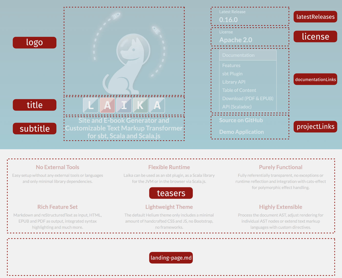
The left side of the header introduces the project, ideally you would choose at least one of the three options (logo, title and subtitle). In the case of Laika's site for example, the title is omitted as the project name is already part of the logo.
Below the subtitle you can also add a row of links, which may be a menu, icon links, text links or even a
version menu, by using the titleLinks property.
This is the most prominent position for links on the landing page.
On the right side, the latest release info usually points to one or two releases, the latter if there is also a milestone available. The panel for documentation links can be any links right into the content of your site, like Getting Started pages, tables of contents, or a link to the API documentation.
The project links below can be any set of additional links, e.g. GitHub, Twitter or your chat.
Like with the top navigation bar of the main page, you can choose between an IconLink with optional text,
a ButtonLink with an optional icon, a plain TextLink or a horizontal group of links (LinkGroup) which
are usually a row of icon links placed into a column of text links.
Internal targets use virtual paths like always and will be validated.
Finally, a set of teasers which are quite common on landing pages can be defined for the white area below the header.
Additionally or alternatively you can also add a regular markup document called landing-page.<suffix> to one
of your input directories and its content will be inserted at the bottom of this page.
This is in case you want to stick with the traditional approach of some sites, which give you 'Getting Started'
style content right on the start page.
It can also be used to list adopters, provide a feature overview or links to presentations or videos.
Cover Images for E-books
You can include cover images for EPUB and PDF files. They will also be used to display little thumbnails on the download page.
import laika.ast.Path.Root
import laika.config.CoverImage

Helium.defaults
  .epub.coverImages(CoverImage(Root / "cover.png"))
  .pdf.coverImages(CoverImage(Root / "cover.png"))
See Supported Document Types for a list of supported image formats.
Auto-Linking CSS & JS Files
If all the configuration options shown above don't give you enough flexibility, you can always include additional CSS and JavaScript files to tweak the site's look & feel.
You can examine the CSS generated by Helium and override individual style declarations. They will always be included in a way that they have higher precedence than the theme's styles.
For internal resources you can specify search paths (entire directories) to be scanned and all
documents with a matching suffix (either .css or .js) will be included.
You can alternatively also specify a path pointing to an individual document.
import laika.ast.Path.Root

Helium.defaults
  .site.internalCSS(Root / "my-css")
  .site.internalJS(Root / "my-js")
Like everything in Laika, the paths are virtual and not file system paths, so they must point to somewhere within the configured inputs.
There are also corresponding methods for external resources (.site.externalCSS and .site.externalJS) and
for inline scripts and styles (.site.inlineCSS and .site.inlineJS).
Equivalent methods are also available for EPUB output via the .epub selector, except for the inclusion
of external resources.
The use of JavaScript in EPUB templates might need additional configuration, in particular with customized templates. See JavaScript for EPUB for details.
Conditional Inclusions
In cases where you want to link styles or scripts only for some documents, you can specify an optional
condition to be checked for each document.
It is a simple filter function of type Document => Boolean which enables inspection of both,
the document's AST and its configuration.
This can be useful when integrating larger libraries like renderers for diagrams or math,
where you might want to inspect the content of the page to verify it contains any nodes that need that functionality.
Helium.defaults
  .site.externalJS(
    url = "https://foo.com/lib.js",
    condition = _.path.name == "special-doc.md"
)Setting Common Tag Attributes
The API for inclusions also allows to set some of the most common attributes for script and link
tags. The following example sets the defer attribute as well as an integrity value.
Helium.defaults
  .site.externalJS(
    url = "https://foo.com/lib.js",
    attributes = ScriptAttributes.defaults
      .defer
      .withIntegrity("xzy-abc")
)Mermaid Diagrams
Helium supports Mermaid diagrams enclosed in fenced code blocks. In contrast to most other functionality in the theme, it is only available for HTML output, not for EPUB or PDF.
A small sample diagram like this:
```mermaid
graph TD
A[Client] --> B[Load Balancer]
B --> C[Server-1]
B --> D[Server-2]
```
will render in this theme like below:
graph TD
A[Client] --> B[Load Balancer]
B --> C[Server-1]
B --> D[Server-2]
It will pick up the theme colors you have defined for Helium, and cannot be configured separately. See Theme Colors above for how to configure the Helium color sets.
Custom Templates
In cases where even custom CSS files do not give you the level of control you need, the final step (apart from creating your own theme), would be to create your own default templates.
As a starting point you can copy and modify Helium's default templates, which you can find here. Or you can start from scratch and only use the existing templates as an inspiration.
Any default templates placed into the user input directories will override the corresponding templates with the same path from a theme. This way you can always customize just one of the templates, while keeping the rest as provided by the theme.
For an introduction to the template syntax, template file names and more details see Creating Templates.
Customizing Template Fragments
If you only want to adjust a small aspect of the theme and otherwise stick to the default Helium look and feel, you can alternatively just override one or more template fragments.
Global Overrides
If you want to replace one or more fragments globally, you can place them at /helium/templates/<fragment>.template.html
inside one of your input directories,
where <fragment> is one of head, topNav, mainNav, pageNav or footer.
The names should be self-explanatory.
Overrides per Document
Finally, when you want to apply a custom fragment to individual markup documents, you can explicitly refer to it in the configuration header of the markup document:
{%
  helium.site.templates.head = ../my-custom-head.template.html
%}
The path is interpreted relative to the markup document, but has to be somewhere within one of the specified input directories, as templates are parsed and cached upfront before getting applied to documents.
All HTML templates must have a name with the pattern <name>.template.html.
The configuration key to assign them to has the format helium.site.templates.<fragment>
where <fragment> is again one of head, topNav, mainNav, pageNav or footer.
Finally, like with all Laika configuration, you can also use different scopes than just the current document.
Using these config keys in a file directory.conf sets the override for all document in that directory
and all its sub-directories.